Project Bebop
Cowboy Bebop was released in 1998 and has stood the test of time like no other show. From the Iconic soundtrack that hooks you in, the silky dialogue that keeps you engaged and the charismatic characters, this show gives you a fresh feeling every time you watch it. It brings together so many genres and styles while managing to seamlessly fit them to the unique style of the show.
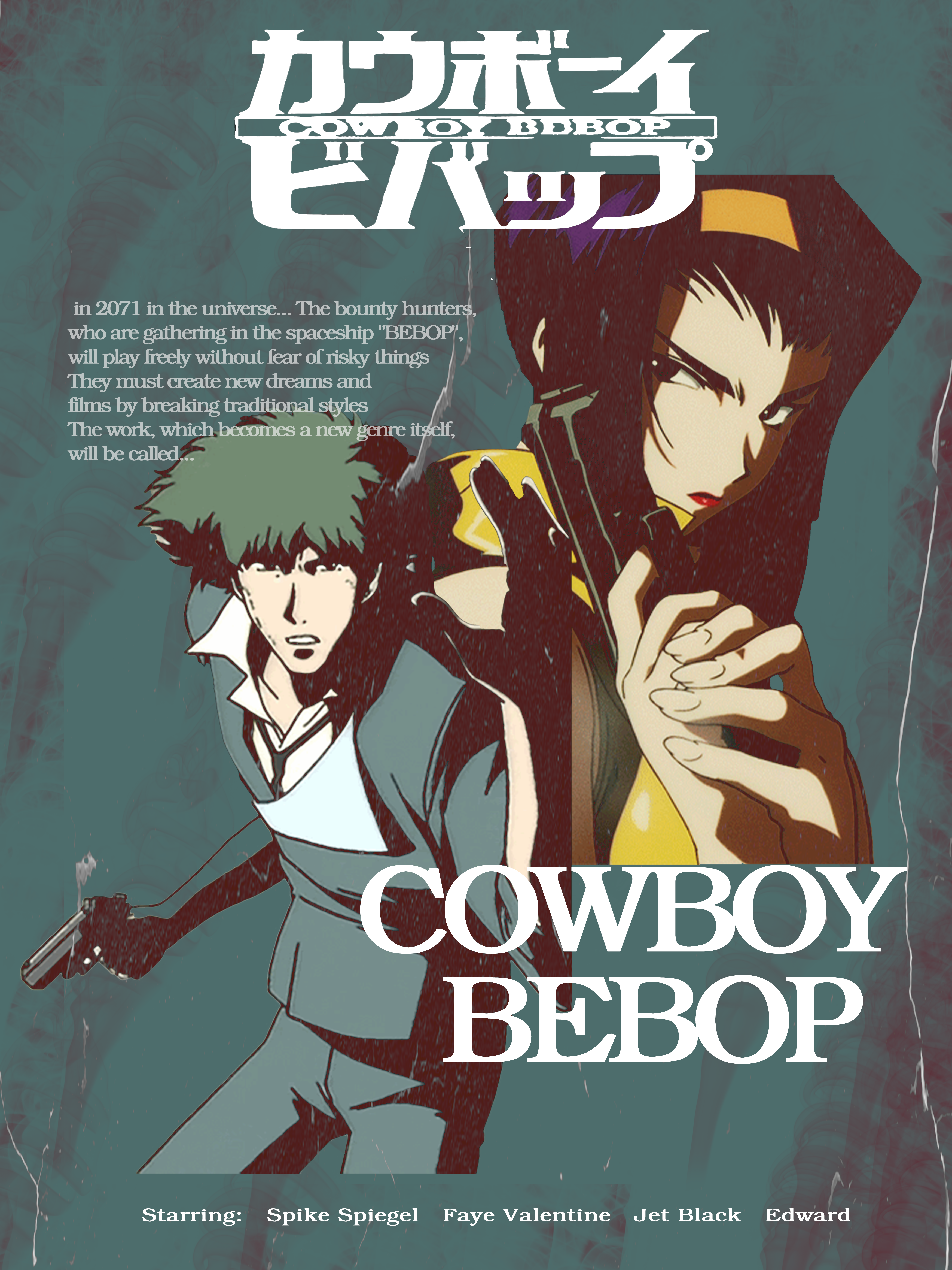
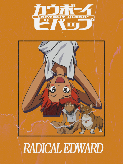
I created Individual character posters for each member of the Bebop crew, as well as an overall film poster for the show as whole. As well as some potential merchandise in the forn of Apparel and Poster decoration.

When designing the "film poster" I drew from the very strong film noir influence that is felt continually through-out the show. I looked back at classic film noir posters as well as some pulp fiction novel covers and found the style complimented what I was trying to incorporate.
Once I decided on the style sourcing the right images was the next step. Finding images that fit the genre and the essence of the show, then applying the lighting effects to get them ready.
It was an interesting challenge to design the piece, looking for the right images and finding colours that mesh well.
One of the important themes of the show was about the dealing with the past and each character's relationship to the past. . One of the iconic lines related to the show is "you're gonna carry that weight" although it isn't said by a character but is a tag line at the end of the last episode but is so synonymous with the show is because it perfectly contextualises the whole show.
I wanted to try and include this theme in a subtle way in each of the character posters. Overall, all I wanted to go with a very minimal and retro feel to each poster while showing individual personality and still have continuity between each one. So I decided one a template of a block of colour, with the title and a quick tag line.
Starting out with Spike, who is the character the show ends and starts with. I took a unique approach with Spike he is the only character I didn't use a coloured photo for him but instead his ship, swordfish which is the reason I chose the colour red for the background. He has a mentality of going with the flow or to use his words "whatever happens, happens." So we just get a sense of his stoicism while hinting at the fact that he is carrying some serious weight.
Next was Faye, She is the only member actively seeking out her past, trying to find answer but when she does find her past, there's nothing left of it, so she returns to the only place she has left, The bebop to the only people she has left. She gets closure as she spent so long looking for where she belongs through fragments of her memories, but she finally has a place where she belongs. She gets up to a lot of mischief and getting herself into trouble by rushing into things which is reflected when she says the words "easy come, easy go"
The words on Jet's poster highlight his role as the rock of the crew, he is the owner of the ship and is the wise and most stoic of them all. He is the calm among the chaotic crew. The words in his poster highlight him as a source of wisdom and are ultimately another message that the show passes along.
Ed was a burst of happiness and eccentrics that seemingly had a positive effect on the members somewhat, the childlike joy is where there is little to no darkness on Eds poster
The aim was to create designs that provided both a cool piece to look at but something that could also be worn, something you would enjoy seeing on a jacket or T-shirt.


